Mobile Phone Concepts
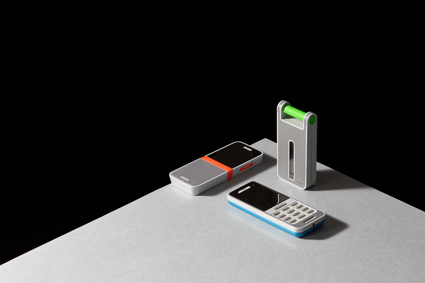
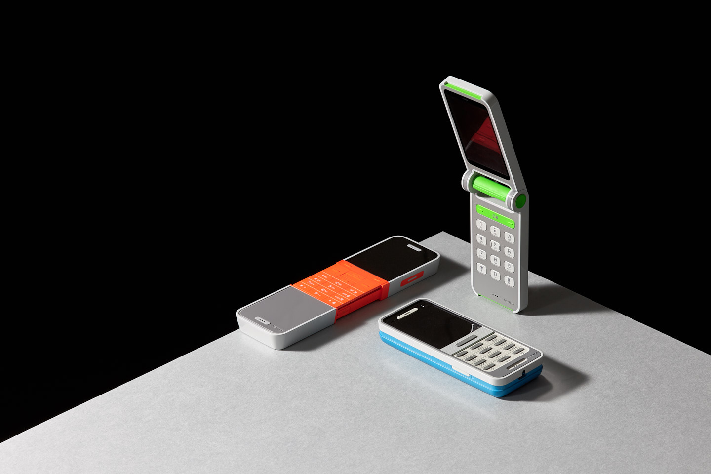
‘Parallels’ is a concept design study intended to highlight alternative approaches to feature phone handset design. The project takes three principal architectures (monobloc, slide and fold) as the basis for exploration of the user’s physical interaction of each form factor.
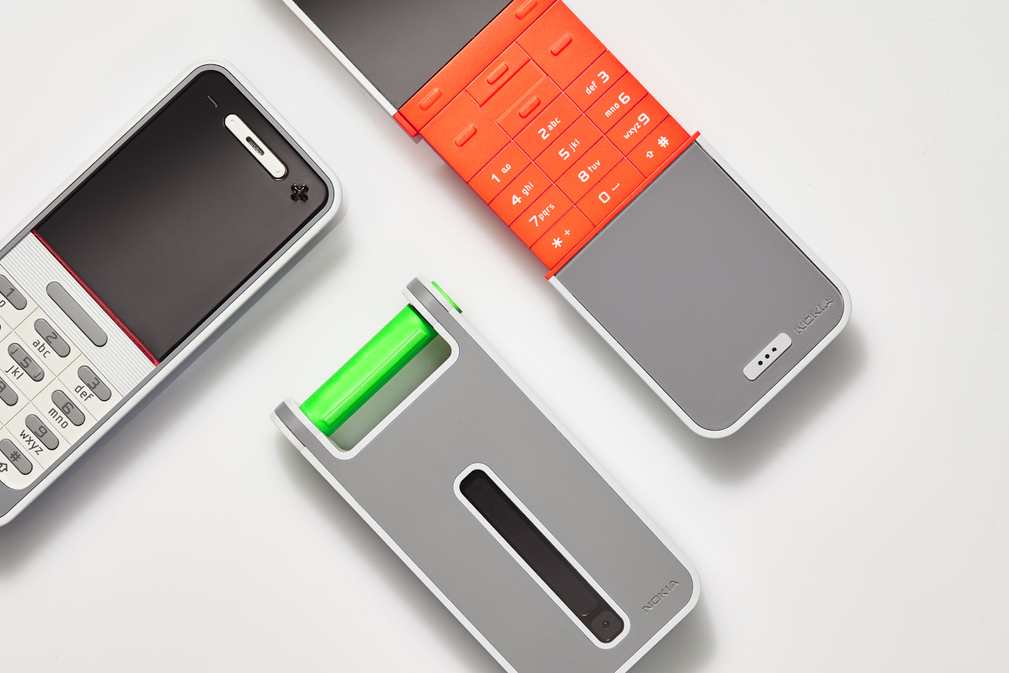
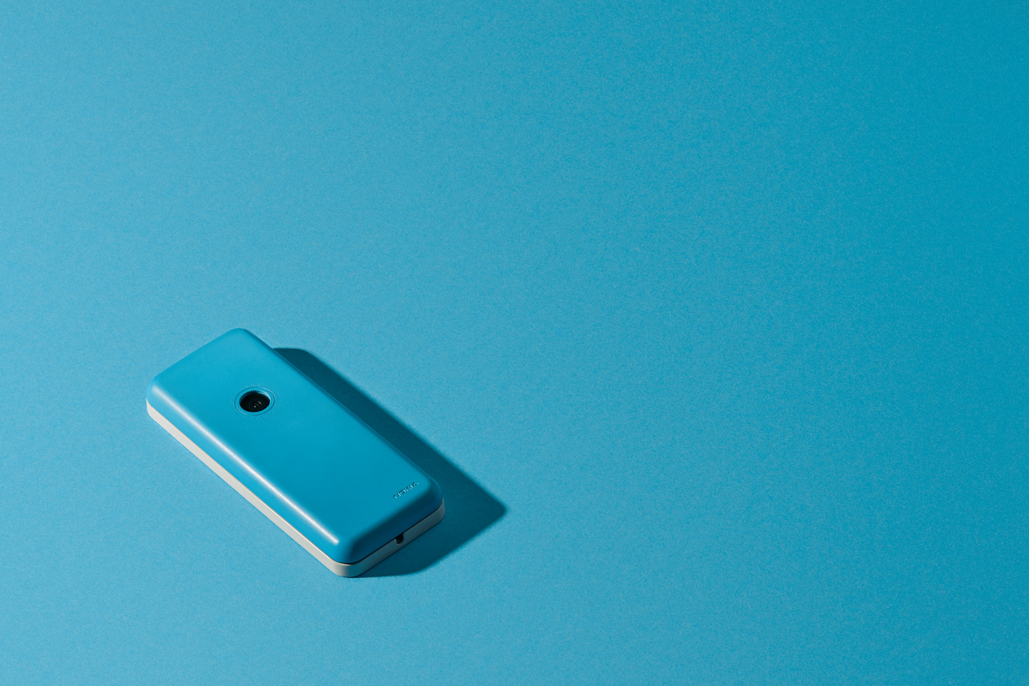
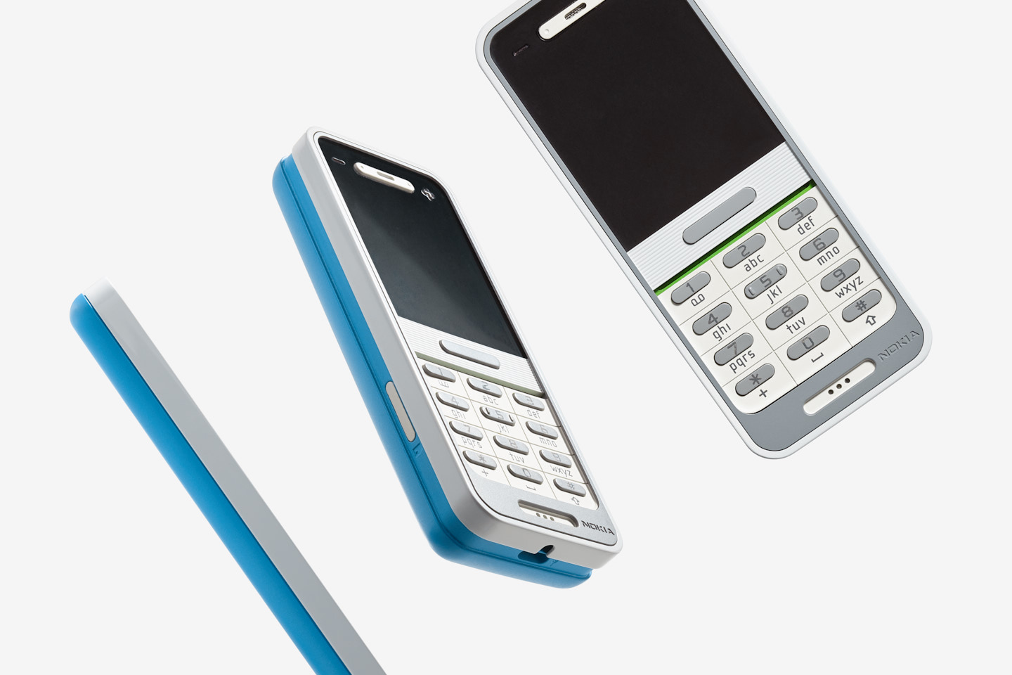
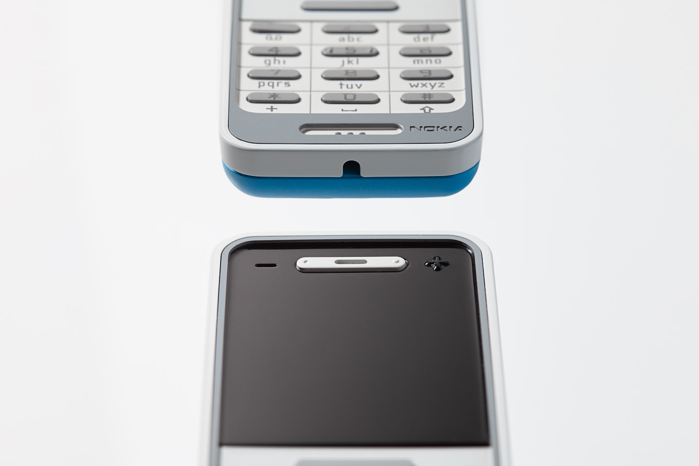
The monobloc concept looks at the often confusing key lock combination on such models and proposes an alternative where the navigation bar itself can be physically slid up to unlock and slid back to lock the keys. Sliding the bar back and holding allows the back of the phone to spring out, revealing hidden ports and connectors around the side. Another design features include the subtly recessed screen and keypad to offer protection and the intuitive arrangement of the volume keys around the ear piece.
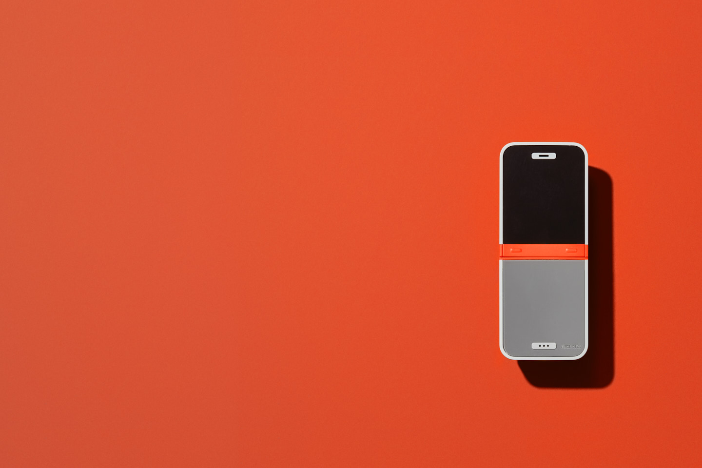
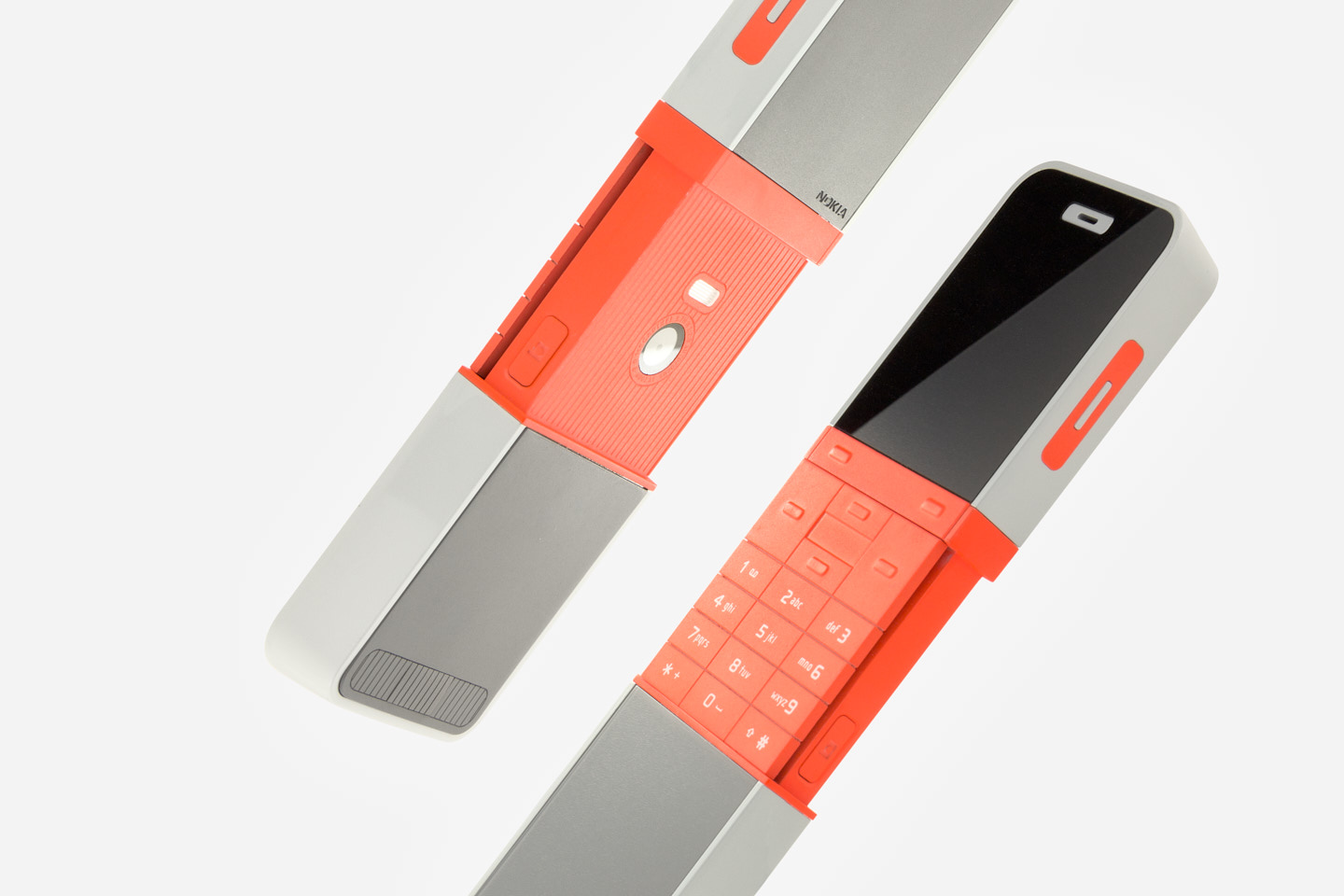
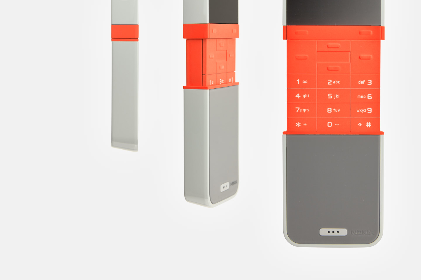
The design for the slide phone considers one of the key flaws in many slide phones, namely that the recessed keypad when open results in the top and bottom row of keys being difficult to access. To address this the Parallels slide has an articulating key pad which pops up becoming flush with the top surface when you open the device and automatically retracts when you close it. Basic call and navigation functionality is also possible with the phone closed using the soft keys. Sliding the phone open also reveals the camera and shutter button, a nod to the famous Minox camera.
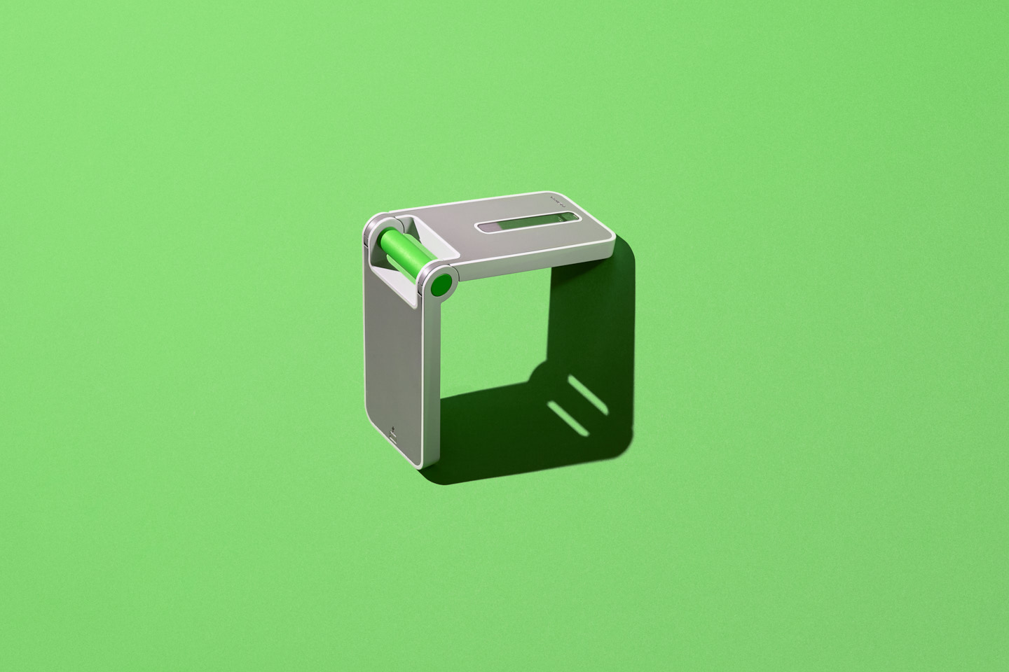
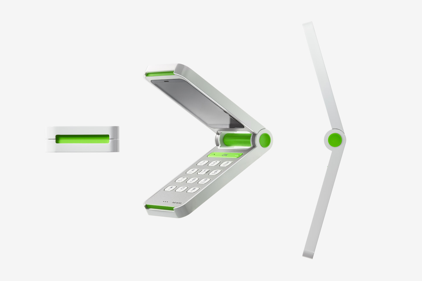
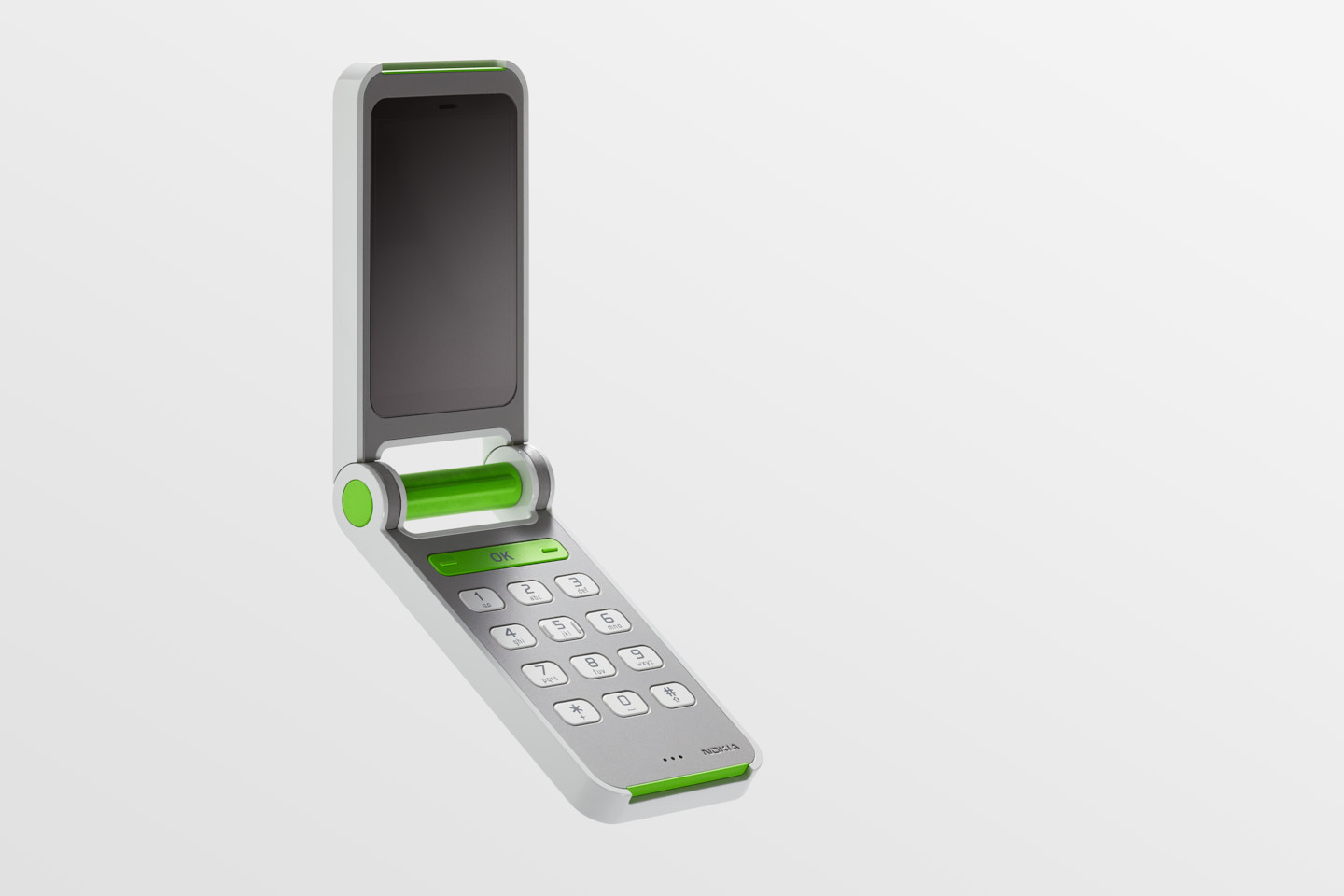
The fold phone was conceived thinking of the simple but highly functional up/down/select user interface found on early Nokia models. This simple scrolling interface suggested a physical roller-like hinge barrel for intuitive up/down scrolling navigation. A single row display on the outside of the phone gives caller notification while the concentric side button on the outside of the hinge allows the user to either reject a call (when closed) or take a photograph (when open).
The overall approach to the project was characterised by a rigorously simple design language and embodied by a solid visual and structural cast magnesium chassis elements, finished in a rich primer grey lacquer and complemented by bold coloured accents. Overall the primary functional elements of each phone were highlighted while all secondary function such as ports and connectors were either hidden or reduced in the visual hierarchy.
